In my recent talk to the Royal Photographic Society’s Historical Group about the 1846 Series of Calotype Views of St. Andrews, I touched on the strangeness of the title page (the “gold” typeface, the questionable publication statement, the vignette etc.). I’ve worried away at this since and want to offer some potential clarifications.
The title page poses a set of five problems which I’ll deal with in turn. These are: 1. the vignette; 2. the choice of wording for the album title; 3 and 4. The gold lettering on the page, and the wording of the publication statement (I’ll deal with these together as the issues are linked); 5. the overall design and layout of the title page.
1. The Vignette
There is, first of all, the issue of the vignette. Larry Schaaf was the first to point out that the images used here – one of Blackfriars Chapel, one of the Cathedral – were not drawn from the same series or image sequences as the rest of the album. Instead, they appear to be earlier work, made with a smaller negative, by Robert Adamson’s elder brother Dr. John Adamson. In my talk, I drew on the Adamson’s pre-1843 work in St. Andrews and its commonalities with the album sequence to place the album in the context of St. Andrews and the continuing creative relationship between Robert Adamson and the photographic circle around Professor David Brewster. The vignettes only reinforce this relationship, suggesting that the albums were created specifically as a continuation of the pre-1843 circle’s work rather than being in any sense a return to St. Andrews by the team of Hill and Adamson.
2. The Choice of the Album’s Title
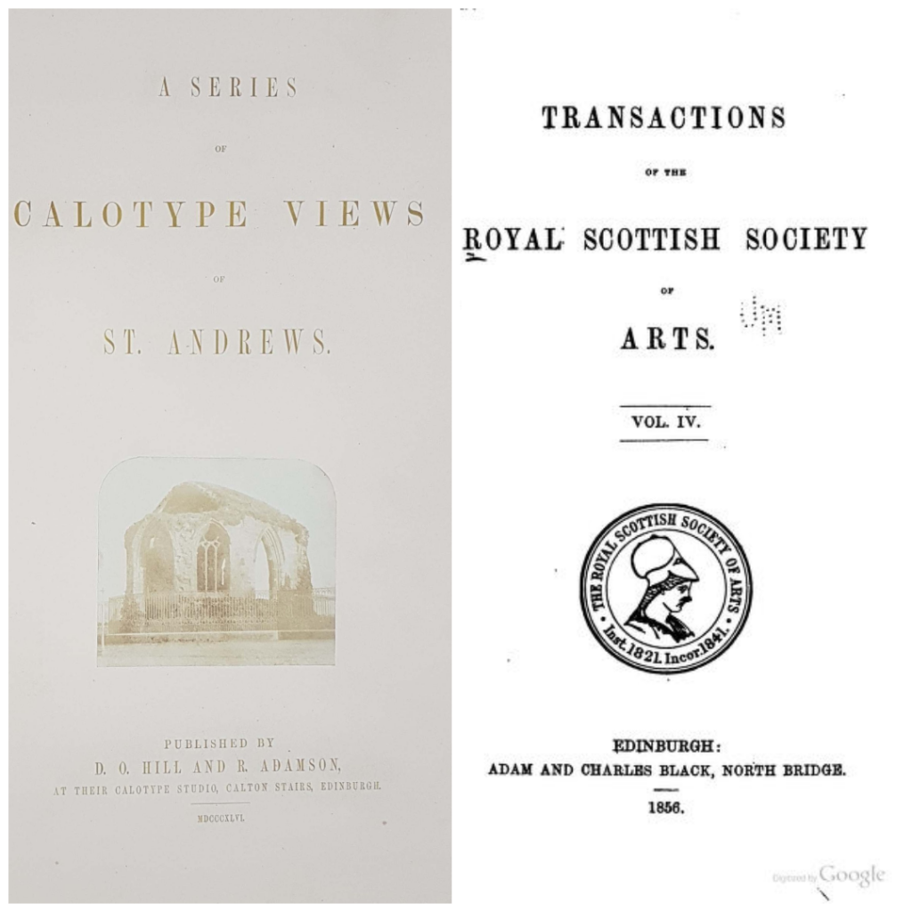
One issue that I did not raise in the talk was that of the title itself. Prior to 1846, there had been only two public or subscription releases of photographic collections in the UK, and these – Talbot’s “Pencil of Nature” and “Sun Pictures of Scotland” were both titled, introduced and captioned for an audience that was new to photography and expected to struggle with the concept. At this point, specifically photographic terms mostly circulated amongst readers of technical journals and those specifically involved in photography. It is this readership that the album’s title “Series of Calotype Views of St. Andrews” addresses – those familiar with the word “calotype” and the technology behind it. The album was intended for an audience of photographic insiders, which also may perhaps account in part for the absence of the editorial paraphanalia found in “Pencil of Nature” and “Sun Pictures in Scotland” – prefatory statements, contents, captions and so on. It was assumed that the audience would know what they were looking at without further explanation. (The absence of editorial and text may also indicate that the album was produced in small numbers with specific recipients in mind, with the intention to address each recipient individually with e.g. a letter, or to have the album presented personally).
3 and 4. The Gold Lettering on the Page, and the Wording of the Publication Statement
Two other issues remain: that of the gold lettering of the title page, and the wording of the publication statement.
In the talk, I merely set out the problems: gold printing was highly specialised and unusual at the time, with contemporary Scottish examples extremely hard to come by: the choice to use it would have been profoundly deliberate and intended to communicate something of the album’s ambition and intentions.
As for the statement – “Published by D.O. Hill and R. Adamson, at their Calotype Studio, Calton Stairs, Edinburgh” – I stated that publication in 1846 carried a specific legal meaning for texts, in that “published” items had to have been made available to general public sale and registered with the Stationers Office in London (this happened with “Pencil of Nature” and consequently it appears in the various contemporary lists of published works issued at the time to booksellers and librarians). Material could also be issued via subscription (sale to a pre-arranged list of purchasers, as was done with the 100 copies of “Sun Pictures in Scotland” in the format on which the St. Andrews album appears to be modelled) or by gift (as per the various individual albums issued by David Octavius Hill to artists and friends, modelled on the format of David Roberts’ “Holy Land”, some of which survive today).
In the talk, I added that the issue with the publication statement was complicated by the text being precisely that printed on the back of individual Hill and Adamson prints sold by David Octavius Hill’s brother Alexander at his print shop on Edinburgh’s Princes Street.
Since the talk, I have become aware of the work of an innovative lithographer, an emigrant living in Edinburgh, Frederick Schenck, who, as one half of the partnership Schenk and Ghemar, produced a lithographic work illustrating the extraordinary Perthshire Chapel of St. Anthony the Eremite at Murthly. The work appeared in 1850, some four years after the date given on the St. Andrews title page, and was published in Edinburgh by Alexander Hill. The entire work is lithographed including the text, and the list of illustrations is given in lithographed lettering of the same gold shade as the title page of the St. Andrews album.
Schenck would become a Fellow of the Royal Scottish Society of Arts and lecture to the Society on innovations in lithography: his ambitions for lithography expressed in an 1844 paper – that it enable mass production of art illustration of the highest quality and in fact become a medium of art in its own right – closely and strikingly mirror those of the calotypists venturing into the first photo books at the time.
This is not to conclude that the St. Andrews title page was also the work of the Schenck studio, although Frederick Schenck was present in Edinburgh at the right time to have undertaken the work. Alexander Hill worked with a range of lithographers over a considerable period of time – and had published David Octavius Hill’s lithographs of Perthshire twenty years earlier.
But it does suggest that the coincidence of the publication statement with the text printed on the back of the Hill and Adamson salt prints is not in fact coincidental and that the work of assembling the album was placed close to home in the hands of Alexander Hill.
5. The Design of the Title Page
The title page leaves us with one final mystery. Schenck’s lithographed title page for the Eremite’s Chapel is of a type with Talbot’s title page for “Pencil of Nature” and David Octavius Hill’s florid title pages for his vast gifted centuries of calotypes. The Schenck title page is reminiscent in fact of the practice for early Victorian illustrated books more widely. The title page of “A Series of Calotype Views of St. Andrews” is by contrast stately, restrained, even eighteenth century in feel.
To move towards understanding the aesthetic and intellectual choices that led to this, I would like to draw attention to similarities between the layout of the album title page and those of title pages of contemporary intellectual journals, with that of the Transactions of Professor David Brewster’s Royal Scottish Society of Arts (publishers of Friedrich Schenck’s paper 1840s paper) being particularly reminiscent. If the use of the term “Calotype” in the album title is indeed indicative of the album being aimed at an informed audience, so might be the title page’s aesthetic.
In my last post, Notes on “Returning to Robert Adamson”, I pointed towards “a version of the Calton Hill partnership that posits Adamson as auteur and Hill as impresario (which is roughly where I stand) means that the St. Andrews relationships – Robert and Dr. John Adamson, both Adamsons and Professor David Brewster, all three and the wider St. Andrews intellectual and scientific community – come to the fore, and the story ceases predominantly to be an Edinburgh one, or entirely an Edinburgh one. Calton Hill becomes to some extent an artistic and scientific colony of St. Andrews, instead of St. Andrews being the erstwhile and abandoned site of an origin story as it is now”. If my suggestions here in this new post hold any weight, that version of the album’s origins as a product of the St. Andrews intelligentsia aimed at an informed photographic audience are reaffirmed.